The Evaluation
1. In what ways does your media product use, develop or challenge forms and conventions of real media products? As my magazine will be new to the music industries market, I made sure the header would make an impact as well as becoming easily recognisable, it has been placed at the front so that if a different image was used it would still be viewable, making it become remembered before it goes behind the main images.
I have put the price on the top corner so it can be seen easily but the barcode box is at the bottom as this is the last place the consumer’s eye will look at, meaning I am not wasting valuable space on something that is not relevant to the magazine front cover.
I have put the price on the top corner so it can be seen easily but the barcode box is at the bottom as this is the last place the consumer’s eye will look at, meaning I am not wasting valuable space on something that is not relevant to the magazine front cover.
2. How does your media product represent particular social groups? Mine is aimed at the type of audience that would buy KERRANG! Or NME and so I have used a photo of a female in which males and females can relate to, I have made the model pose in an open look with her hands on her hip so that others would feel comfortable approaching her. She is also wearing a patterned top that the audience might have seen on the local high street so they think that she is just someone like themselves. It would also be aimed at people between the age of 16 and 35 as these audiences would be interested in new bands and/or interested in latest news on other rock bands.
3. What kind of media institution might distribute your media product and why?After through research, I found that Bauer sold products such as KERRANG! and ranging to others like Q, this I thought would be a good choice as they would already have established connections within the music industry, meaning they could get it on the shelves instantly.
4. How did you attract/address your audience? How did audience feedback help you to make important decisions? I found they wanted more information than advertisements and little things that make it annoying to find you spend money on a magazine and get something completely ifferent inside to what was advertised on the front so everything is specific and honest, as it will then create a bond between reader and magazine, making them want to read the next one…
5. What have you learnt about technologies from the process of constructing this product? It would be easier to create a magazine with a specifically made programme, as Publisher although made for this type of thing, couldn’t handle the creativity required to create a magazine that would go on sale on the consumer market.
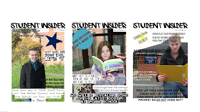
6. Looking back at your preliminary task, what do you feel you have learnt in the progression from it to the full product?I feel that I have learnt to be subtle and to try and make things more visual appealing to a wider market rather than what you individually like as the questionnaires hold vital information to a successful magazine and a non-successful magazine.


