Here i have duplicated a magazine front cover that is/was on the market recently and so is aimed at current target audiences.
Blog Archive
Monday 31 January 2011
Friday 21 January 2011
Monday 17 January 2011
Sunday 9 January 2011
Three Magazine Covers
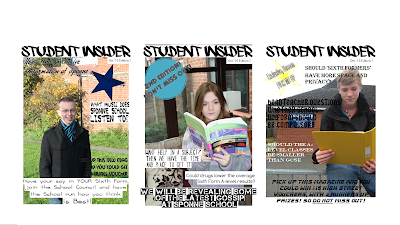
My Three Magazine Covers....

I feel the success' from my three magazine front covers consist of the use of different fonts and layout. These both make the magazine stand out on the shelf as they are colourful and jump out at your eye. I feel the contrast between clothes, books and background makes it look more exciting.
A downfall to all three magazines i feel is the
Friday 7 January 2011
Assigning Genres To Magazines
How genre is communicated to the audience
>Masthead
Example:- Its name will often give away its genre
>Font
Example:- A soft, curvy font would show pop, but a loud, bold font might show rock
>Colours
Example:- Pink and white would be pop, and black or dark colours would be rock
>Props Used
Example:-
>Main Image
Example:-
>Band/Artist Interviewed
Example:-
>Contents Listed
Example:-
>Representation of the artist including features of Mise-en-scene
Example:-
I have chosen the categories from the aesthetics of the front covers and what they advertise. The dark colour shows whether it is a very loud, or the white and light colours show its dance and pop genre. This also depends on the artists used and the camera shoot they are shown by. The masthead also gave away a clue to what genre music it would sell to the consumer. Personal knowledge helps to identify certain magazines. I found that the artist in the pop magazines were heavily made up with fair skin, were as the rock bands showed the band as they are better well known as a group than individual artists like Madonna and Katy Perry. The masthead becomes familiar to each magazine so you can recognise its genre and audience straight away.
Subscribe to:
Posts (Atom)


